



Two Decades of Dance: The Visual Evolution of The Warehouse Project
As Manchester’s legendary event series celebrates its 20th anniversary, co-founders Sam Kandel and Richard McGinnis are revisiting the archives. By examining the evolution of their iconic promotional flyers, they offer a unique lens through which to view the transformation of The Warehouse Project (WHP) and its profound impact on the UK’s electronic music landscape.
From Boddington’s Brewery to Global Icon
Since its inception in 2006, The Warehouse Project has evolved from a localized, seasonal experiment at the historic Boddington’s Brewery into a titan of the global nightlife industry. The brand’s trajectory is marked by its nomadic spirit, moving through iconic Manchester landmarks like the subterranean Store Street, the industrial expanse of Victoria Warehouse, and its current sprawling home at Depot Mayfield.
This constant migration has been a core component of the WHP ethos, keeping the experience fresh and unpredictable. Recent industry data suggests that the UK’s night-time economy contributes over £66 billion annually to the national GDP, and WHP has consistently served as a primary engine for Manchester’s cultural and economic growth within that sector.
The Art of the Flyer: A Visual Timeline
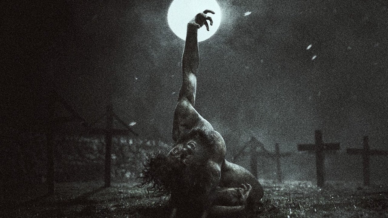
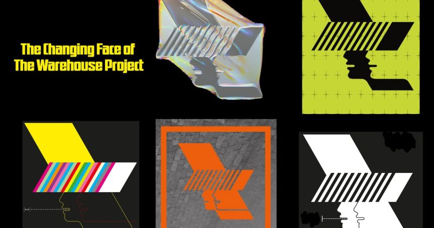
While the venues have shifted, the visual identity of the brand has served as a constant thread connecting two decades of clubbing history. The evolution of their promotional materials-from early, minimalist designs to the high-concept, avant-garde aesthetics seen today-mirrors the maturation of the electronic music scene itself.
Despite these stylistic shifts, certain elements have remained anchored. The original logo, meticulously crafted by Paul Hemmingfield for the inaugural season, remains a cornerstone of the brand. Hemmingfield’s initial vision, which utilized a specific color-coding system to categorize different event series, established a design language that allowed the brand to remain recognizable even as its scale exploded.
Design as a Cultural Marker
The hundreds of posters produced over the last 20 years act as a historical archive. Much like the iconic posters of the 1990s rave scene, which utilized neon palettes and psychedelic typography to signal a counter-cultural movement, WHP’s flyers have adapted to reflect the digital age. Today, the brand collaborates with world-class design studios like Studio Moross and Accept & Proceed, moving away from simple event listings toward immersive, artistic statements that capture the energy of the modern dance floor.
- In Association With: The Warehouse Project
- Editorial: Megan Townsend
- Visual Credits: STUDIO MOROSS, ACCEPT & PROCEED, The Warehouse Project, Paul Hemmingfield
- Published: 26 October 2026