
A Fresh Visual Chapter: Decoding Instagram’s Rebranded Wordmark
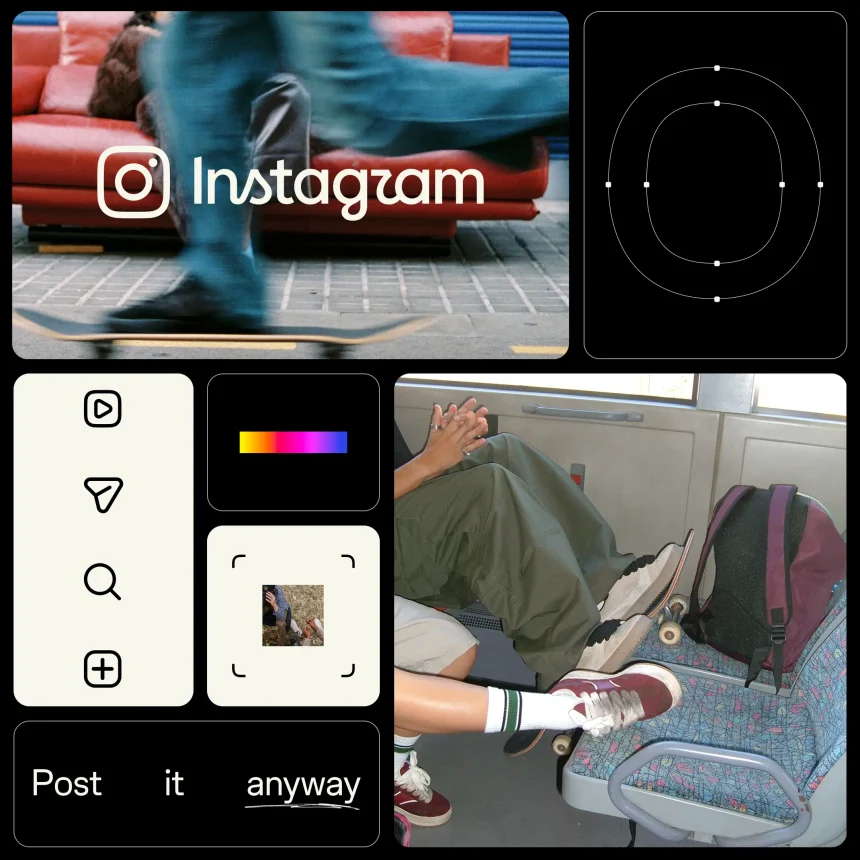
The digital landscape is currently buzzing with discourse following Instagram’s latest aesthetic pivot. As part of a comprehensive overhaul of its visual identity, the platform has introduced a refined wordmark. It is important to clarify for those concerned: the iconic, multi-hued camera icon remains untouched. The primary focus of this design evolution is the stylized “Instagram” script that serves as the brand’s signature.
This update marks a milestone for the platform. According to Meta’s official announcement, this is the first major brand identity refresh in over a decade. Given that Instagram now boasts over 2 billion monthly active users globally, such a change is a calculated move to modernize the brand’s presence in an increasingly competitive social media ecosystem.
The Creative Journey Behind the Script
Unveiled on August 13, the new branding is framed by Meta as a “modern evolution.” Rather than a complete departure from its heritage, the design team sought to honor the platform’s origins while streamlining its visual language for contemporary screens.
The design process was exhaustive. Meta’s creative team experimented with hundreds of iterations, ranging from rigid all-caps typography and literal camera-inspired iconography to various forms of cursive handwriting. Ultimately, the designers chose to refine the existing script, opting for a cleaner, more legible aesthetic that retains the familiar “handwritten” charm that users have associated with the app since its inception.
Beyond the Logo: A Holistic Design System
The transformation is not limited to the wordmark alone. The brand refresh introduces a more cohesive design language that encompasses:
- Refined Typography: The introduction of “Instagram Sans,” a custom typeface designed to bridge the gap between the platform’s heritage and its future.
- Expanded Typefaces: The addition of “Instagram Pen” and “Instagram Mono,” providing more versatility for digital layouts and creative content.
- Motion and Layouts: Updated motion graphics and grid structures designed to improve user experience and visual consistency across mobile and desktop interfaces.
While the typography has been sharpened to appear bolder and more minimalist, the platform’s signature vibrant gradient remains a core component of its identity, ensuring that the brand stays instantly recognizable even as it evolves.




![[Event Review] Washington, D.C. Delivers on a Major Music Weekend](https://www.mixtv1.com/wp-content/uploads/2026/10/39901-attachment.jpg)