
The Viral Metroid Ravenous Logo Trend: Why Everyone is Obsessed
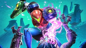
The internet has been swept up in a wave of creativity following the announcement of Metroid Ravenous. What started as excitement for the game has quickly morphed into a massive meme movement, fueled by a clever logo generator that has taken platforms like Reddit and Bluesky by storm. You’ve likely scrolled past images of Samus Aran in a fierce, predatory stance, now paired with absurd, low-brow captions-like “I ASKED FOR NO PICKLES”-all rendered in that distinct, gritty Metroid Ravenous aesthetic.
How the Pixelframe Design Tool Sparked a Meme Revolution
The catalyst for this trend is a custom tool released by Pixelframe Design. This web-based generator allows users to type in any phrase and instantly transform it into the jagged, retro-styled logo associated with the upcoming title. With four distinct background variations to choose from, the tool offers enough flexibility to make any mundane sentence look like a heavy metal album cover. Pixelframe Design is no stranger to this viral success; they have previously launched similar generators for high-profile titles such as GTA 6, The Duskbloods, and the internet-famous Pokopia.
Check out the original generator announcement here.
From Survival Horror to “Girl Dinner”: The Humor Behind the Font
The core premise of Metroid Ravenous-which centers on Samus needing to hunt and consume her foes to stay alive-has provided a dark, comedic foundation for the community. This “eat or be eaten” mechanic has inspired a variety of hilarious internet subcultures. Users are remixing the logo with everything from viral “girl dinner” memes to classic sketch comedy references, such as the frantic “55 burgers” order from I Think You Should Leave. There is something inherently funny about seeing a high-stakes, intense font applied to the most trivial or ridiculous statements imaginable.
See the community’s best creations on Reddit.
A Cross-Genre Aesthetic Shift
The trend has transcended the Metroid franchise entirely. Gamers are now applying the Ravenous treatment to completely unrelated titles, creating jarringly hilarious juxtapositions. Seeing a game as wholesome as Hello Kitty Island Adventure rendered in the aggressive, blood-thirsty Ravenous typeface has become a highlight of the trend, proving that even the most innocent concepts can look “metal” with the right design treatment.